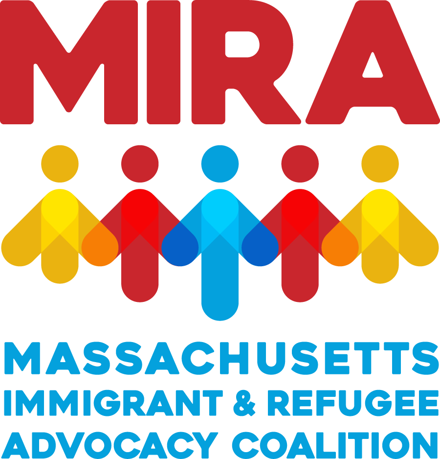
MIRA’s Branding Refresh
Renewing Our Commitment and Celebrating Strength and Resolve as a Coalition
For almost 40 years, MIRA has stood with immigrant and refugee communities across Massachusetts. As we've grown, it became clear it was time for a new look, one that moves beyond our state-shaped logo. We wanted our new branding to encompass the values underpinning all the work being done at MIRA, to reflect the power of our coalition, and to hold the future vision of full inclusion we are working towards. The past few years have brought a lot of change: a larger staff and board, a new advisory council, a new strategic plan, and deeper relationships with the coalition members who make MIRA strong. With our sister organization NHAIR in New Hampshire and our growing role in national work, our identity had outgrown the map of one state.
A logo shaped by our community
We wanted a logo that felt more human and said more about MIRA as a coalition, honoring the diversity and collective strength that move us forward. It also needed to represent all of our work, not just our legislative advocacy, while respecting the familiarity and impact of the original. The process began with a presentation from our Communications team to staff on branding and what it means to capture an organization's "personality."
A few months later, staff and board gathered for an in-person retreat. In small groups, armed with markers and big sheets of paper, we sketched ideas and then shared them with each other. The same themes kept appearing: people holding hands or gathered in solidarity, and lighthouses lighting a path through the dark. We brought these ideas to the design firm Any and Every, who turned them into a new logo. It wasn't a simple process, and it took more than one trip back to the drawing board with staff reviewers. But the final design came together with images and energy we hadn't consciously set out to find, yet which reflect our values and mission beautifully. Staff also named our new color palette, submitting and voting on names rooted in our values:
Sharper messaging
Each year we develop our messaging with colleagues across the organization. This time, we worked with Juma Inniss of The Message to condense and adapt it for different audiences. His fresh perspective, paired with our deep knowledge of a complex organization, helped us land on clearer, simpler language and a messaging guide everyone at MIRA can use.
A more welcoming website
Our website is MIRA's entry point, often the first introduction to who we are – and like an old front door, it was solid and well made, but had been painted over again and again, obscuring its purpose and true identity. It was time to strip it down and think about the website based on how it is used today: as a trusted resource for policy updates and know-your-rights materials, as well as to connect with legal and citizenship help. As with the logo, we built on what was already working, focusing on navigation, functionality, access, and messaging so the site serves every visitor better, on any device.
Thank you
Our deep thanks to MIRA's staff and board, and to the consultants who supported MIRA’s Communications team in bringing this project to life: Any and Every for our logo and visual identity, Juma Inniss of The Message for messaging development and homepage design, and SYP Development for website implementation and functionality.